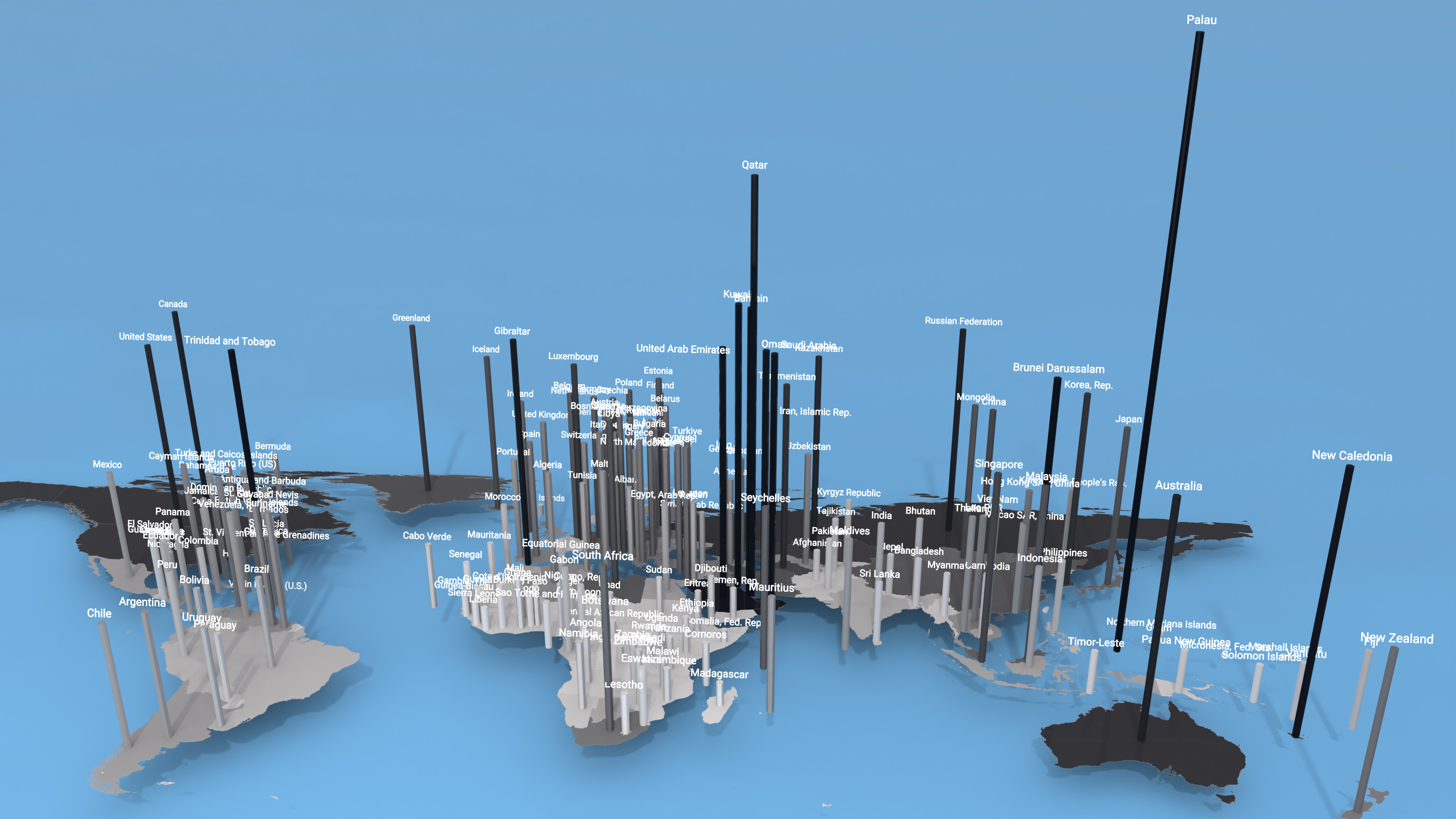
Shifting from total volumes to per capita emissions (measured in metric tonnes of CO₂ equivalent per person) reframes the focus toward individual contribution. In this way, the activity of a single resident is converted into an anthropogenic footprint on the atmosphere.
In this way, the activity of a single resident is converted into an anthropogenic footprint on the atmosphere.The per capita metric is a consequence of many factors: living standards, consumption patterns, systemic opportunities, social responsibility, and governance efficiency. The height of the spires on the map reflects air travel volume, personal vehicle power, the scale of systemic opportunities, and the level of public awareness regarding the anthroposphere's impact on the state of the planet. In this coordinate system, low elevation is just as informative as maximum peak height: it highlights regions with minimal anthropogenic activity.
The global average stands at 4.7 tonnes of CO₂ per person annually. However, this balance is deeply fragmented, with stark extremes in emission levels clearly divided across macro-regions. High-tech Europe maintains a controlled industrial baseline, North America demonstrates consistently high intensity, and Africa remains almost entirely in the shadows, registering just a fraction of the world average. Yet even against Australia, Canada, Russia, and the United States (the top large emitters in per capita anti-rankings, with individual emissions three times higher than the global average), Middle Eastern oil economies and island industrial clusters (Palau, Brunei, New Caledonia, Trinidad and Tobago) break off all scales. Below, we examine these regional poles and their primary anomalies.
Importantly, this map displays sovereign carbon loads on a production basis (agriculture, energy, waste, and industrial sectors) — the volume of emissions occurring directly within national borders. This represents only one side of the global balance. To reveal the hidden levers of the global economy, the next chapter of the Atlas will shift its focus to highlight key carbon footprint anomalies through the lens of actual consumption.
| Country / Region | Per Capita CO₂ Emissions (2024) |
|---|---|
| Loading global data... | |
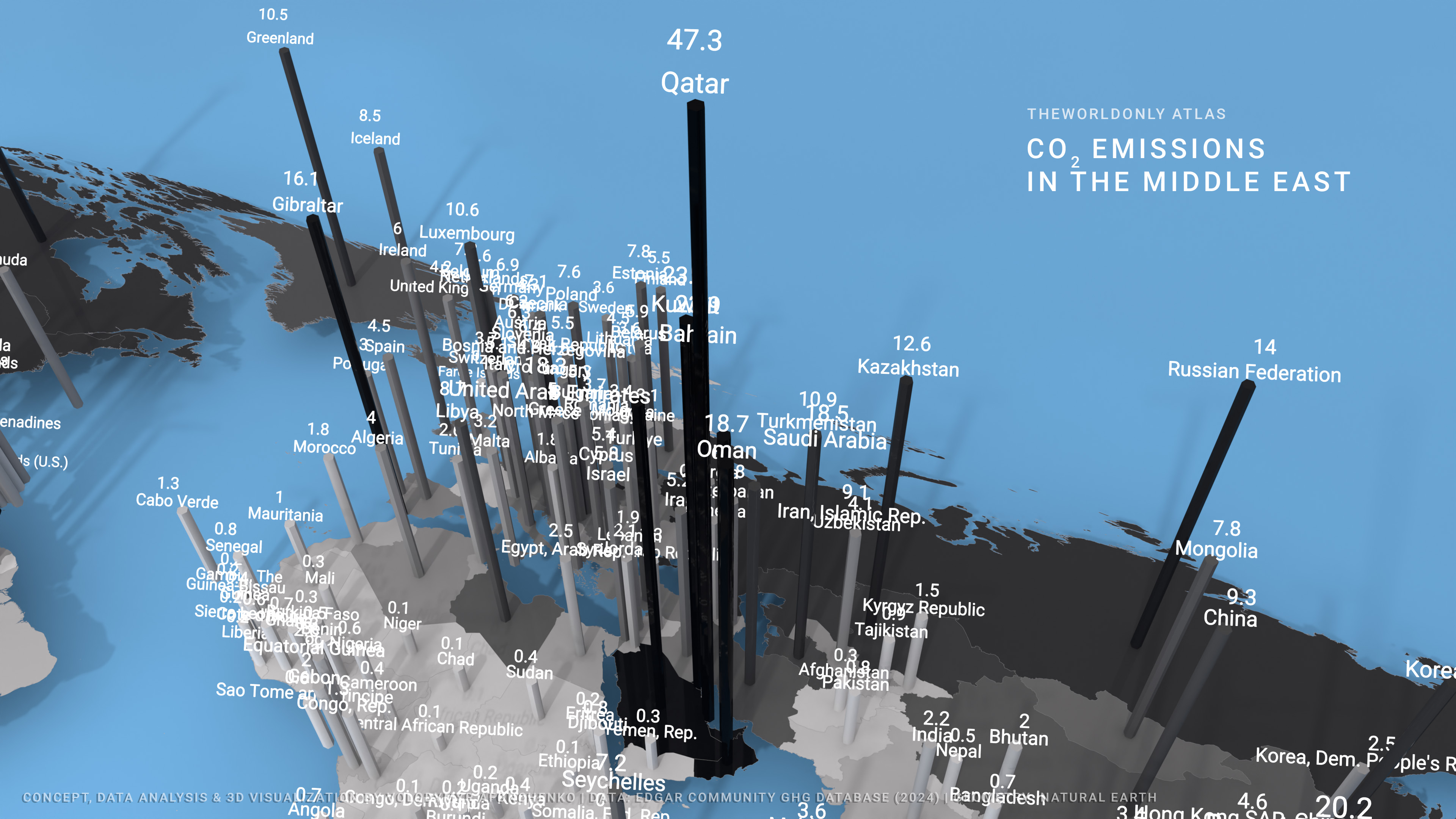
A glance at the 3D terrain instantly reveals that on a relatively small patch of the Persian Gulf, the spires of Qatar, Bahrain, and Kuwait literally pierce the conditional stratosphere of our atlas. This is a classic manifestation of a "per capita anomaly," driven by a unique combination of geographic challenges, hyper-concentrated resource wealth, and domestic extravagance.
This goes beyond merely powering massive glass megastructures in the desert, which demand massive, aggressive energy inputs for air conditioning. It is a mistake to assume these figures stem solely from the household habits of local citizens and the region's geographical quirks. Local consumption is only one side of the coin. The other side lies in the global division of labor. This region supplies the global economy with raw materials and hydrocarbons, and under UN accounting methodology, all production emissions are attributed to the exporting nations rather than the end consumers. In practice, this includes the energy consumed by drilling rigs, pumps, compressors, and the flaring of associated petroleum gas. Local plants operate at maximum capacity, producing cement and ammonia. The power industry is largely dedicated to the seawater desalination required for oil refining, chemical production, and metallurgy. As a result of maintaining these highly complex industrial supply chains for the entire world—amidst extreme resource scarcity — we see these staggering peaks.
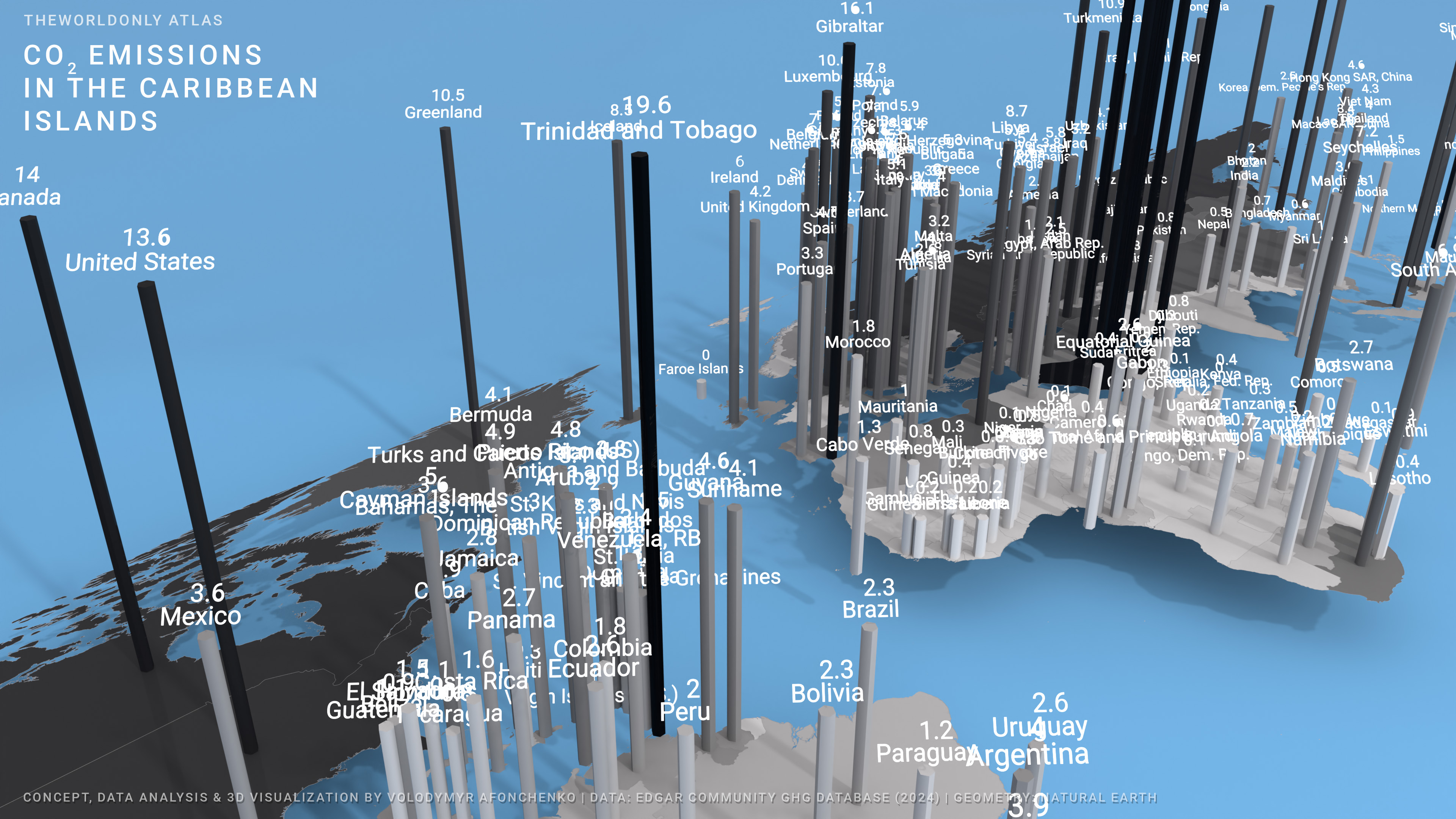
In the public consciousness, exotic islands are firmly associated with pristine ecosystems and green tourism. However, micro-territories and isolated landmasses generate anomalous carbon spikes that surpass even the planet's largest industrial hubs in intensity.
A striking example in the Atlantic is Trinidad and Tobago (19.6 t/capita). This small Caribbean nation has transformed into a global industrial hub: 87% of the country's emissions stem from the production of ammonia, electricity, methanol, liquefied natural gas, iron, steel, and cement. This immense anthropogenic burden is trapped within a closed island biome.
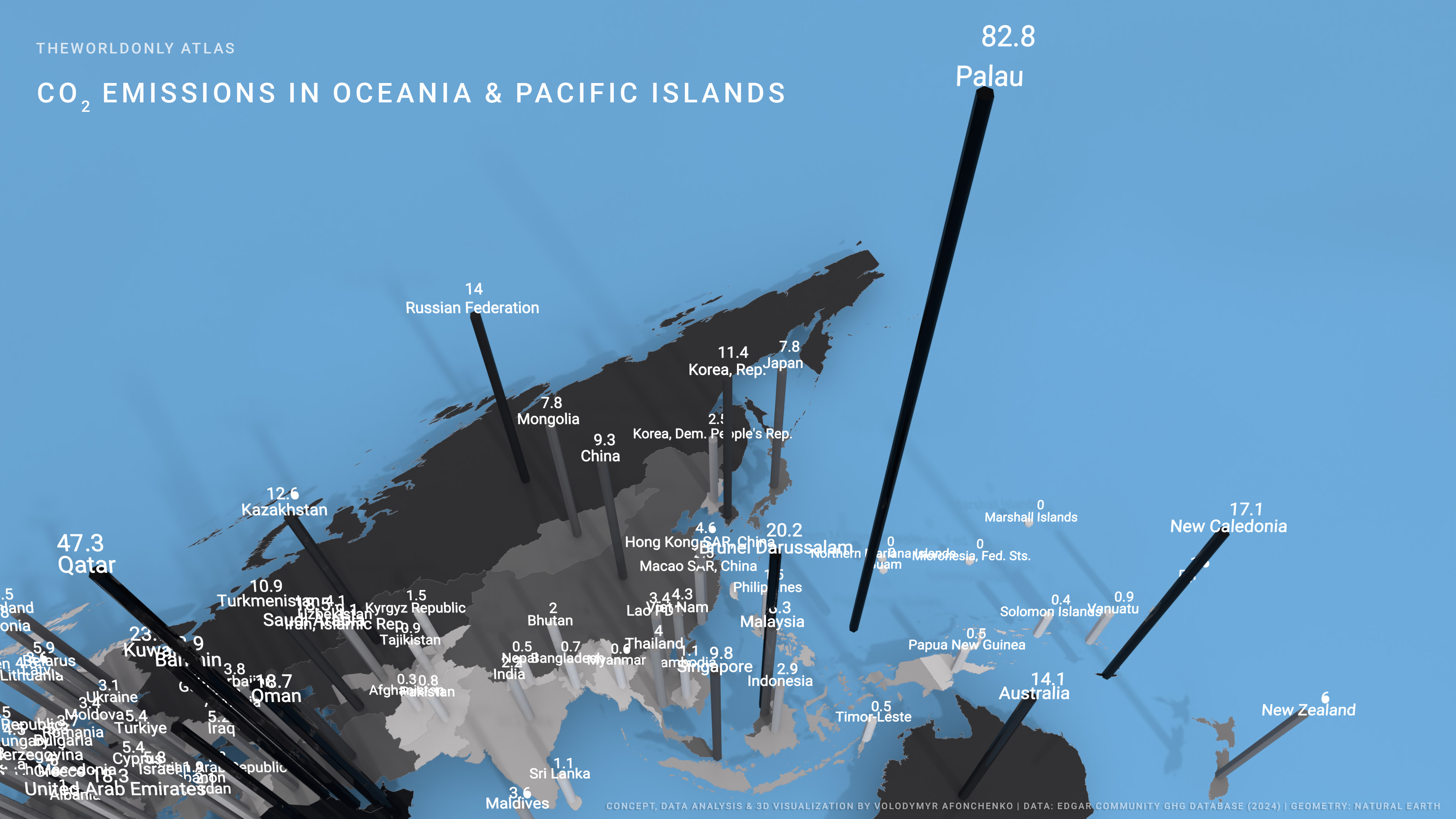
However, the true paradigm shift in data perception occurs when analyzing the island expanses of the Pacific Ocean and the Malay Archipelago. Here, the procedural map drives up three massive spires—Palau, Brunei, and New Caledonia—each representing a unique model of anomaly.
The first spire is Palau—the absolute and paradoxical leader of the global carbon ranking (82.8 t/capita). With no heavy industry on the island, sustaining this remote tourism hub yields massive CO₂ emissions for a population of just 23,000. Driven by total import dependency, transport accounts for 772,000 tonnes and power generation for 489 thousand tonnes of CO₂, fueled by the constant need to import oil products to power the tourism sector and critical infrastructure.
The second spire is Brunei (20.2 t/capita). Located in northern Borneo, this tiny sultanate with a population of less than half a million remains one of the most carbon-intensive nations in the region. At the core of its footprint is large-scale oil extraction and export, as well as natural gas liquefaction—a process requiring immense energy consumption, nearly 99% of which is met by burning fossil fuels. The picture is further compounded by a methanol production plant. Combined, oil and gas account for 91% of Brunei's merchandise exports and 76% of government revenues. On our map, Brunei stands as a solitary industrial monolith surrounded by the jungles of Borneo.
The third spire is New Caledonia (17.1 t/capita)—a textbook example of resource-based eco-colonialism. This special territory of France conceals its footprint behind Paris's pristine green reports while holding a significant share of global nickel reserves, with mineral ores and alloys accounting for 96.3% of its exports. As EDGAR data demonstrates, local smelters burn fuel continuously to process battery-grade nickel. To put this into perspective: a single supply deal for 42,000 tonnes of New Caledonian nickel provides enough material for nearly one million electric vehicles per year (given that a single long-range EV battery requires roughly 50 kg of nickel). This turns the remote islands into a crucial driver of the global green transition, yet the entire anomalous footprint of this refining process is accounted for by the archipelago itself.
An intriguing contrast to this model is found in the European North—Greenland (10.5 t/capita). While formally part of the Kingdom of Denmark (where mainland emissions drop to ~4.3 t/capita thanks to wind power), this icy giant displays a completely different, non-industrial anomaly. Here, the high per capita footprint acts as a "geographical tax." The total absence of roads between settlements forces a reliance on aviation for basic logistics, while the extreme climate traps the population in an infrastructural bottleneck: sustaining Arctic communities remains entirely dependent on burning imported diesel fuel.
Flat tables and one-dimensional rankings offer an illusion of a clear world, while simultaneously masking its core distortions. The primary purpose of this visualization is to highlight the points where planetary balance is disrupted—places where anomalous phenomena occur. These anomalies are not merely the result of pursuing ultra-comfort in the middle of deserts, but a direct consequence of modern global division of labor. The carbon footprint of the global economy has been exiled to the periphery—into oceanic archipelagos and Gulf deserts—revealing two radical models:
The Anatomy of Carbon Deviations:
Coming up in the next chapter: What happens if we recalculate the global map not by production site (where the smokestack burns), but by final consumption (where the finished product is bought)? In Chapter II, we introduce the Consumption-based CO₂ model to return carbon debts to their true originators. The spires of Palau and New Caledonia will collapse, while new carbon mountains rise above the world's primary consumer centers, exposing the true scale of outsourced emissions.
ne_10m_admin_0_countries).
Disclaimer: The boundaries, names, and designations shown on this map do not imply official endorsement or acceptance by THEWORLDONLY.
Leave your email to get priority access to the interactive 3D map of Consumption-based CO₂ and our analysis of outsourced emissions.